Regarding the area of action, which is South Tyrol, the Allianz for sustainability defines the following five fields of action; social justice, climate, environment and scenery, mobility and economy. To reach those goals the interconnection of local institutions is crucial. Even if the general interest in sustainability is given not just within researchers but also in the broad public, the interaction and exchange of information between the institutions is almost non existent till today.

The Logo is a combination of the most important aspects that are reflected in the alliance. Starting with the area SOUTH TYROL, over the kind of organisation; ALLIANCE. The discipline they are dedicated to is RESEACH in the field of SUSTAINABILITY.
All put together is "South Tyrol Alliance for Research in Sustainability".
"Stars" gives away a strong Metaphor which I used as a guide though the process of creating.
Describes a impossible task. Something that does sent even worth trying. Stars - within your reach is the opposite. Big goals which brings us step by step so a more sustainable future. 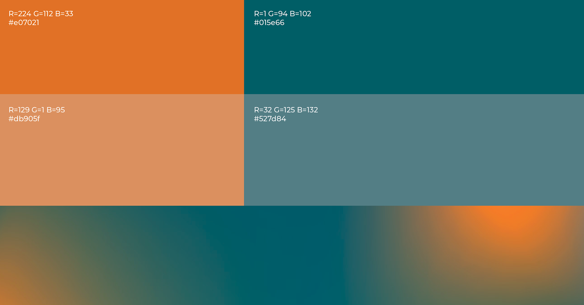
The main colour is a petroleum blue which differs in regard to other organisations which are occupying themselves with sustainability because our research had the result that the big majority uses shades of green. Since the topic of sustainability should be treated as an emergency, orange is used as a signal color to underline the necessity to take action now. In the application, different forms of diagrams are applied, which are carrying the same elements of thin lines, squares and circles.
As application of our developed visuals, we used the interface of a smartphone application. With typography and colours you can also find the imagery which reflects the message of the whole visual identity. By putting together small parts we can create a bigger picture, which allows us to interpret and understand the picture. All the images which are displayed at the beginning of the five main topic pages, are displaying motives which are geographically and meaningly connected to the content.
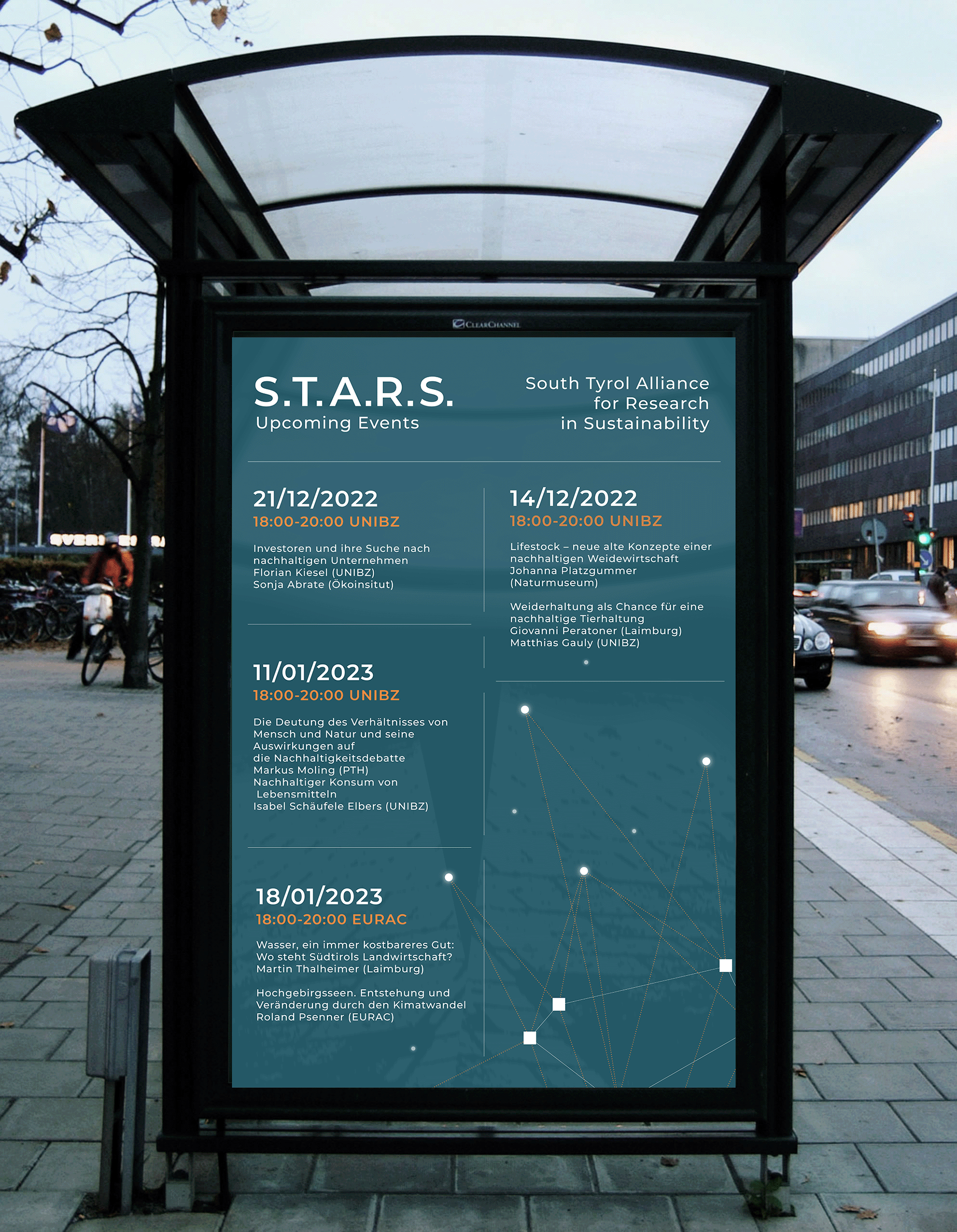
The most important interface to create a contact is a website. The homepage gives some basic information about S.T.A.R.S. starting from the area leading to the night sky created by the combination of the members and the fields of action.
This leads to either the members or the fields of action. The fields of action have each their individual site which is filled with a short introduction, the goals, an infographic element and some links to events, articles or interviews regarding the chosen topic. From there you can see the full calendar following the link to the calendar page. At the bottom of the page the members are presented in an interactive way to discover by the user themselves. From there you can reach a short introduction about the institution, which then leads to their institutional website.
In addition to the simple function the graphic elements, should guarantee a coherent bigger picture. With the help of the strong metaphorical loaded name which allows to experiment with any element that is connected to stars, the idea of letting the single stars direct the user to the single topics was implemented.

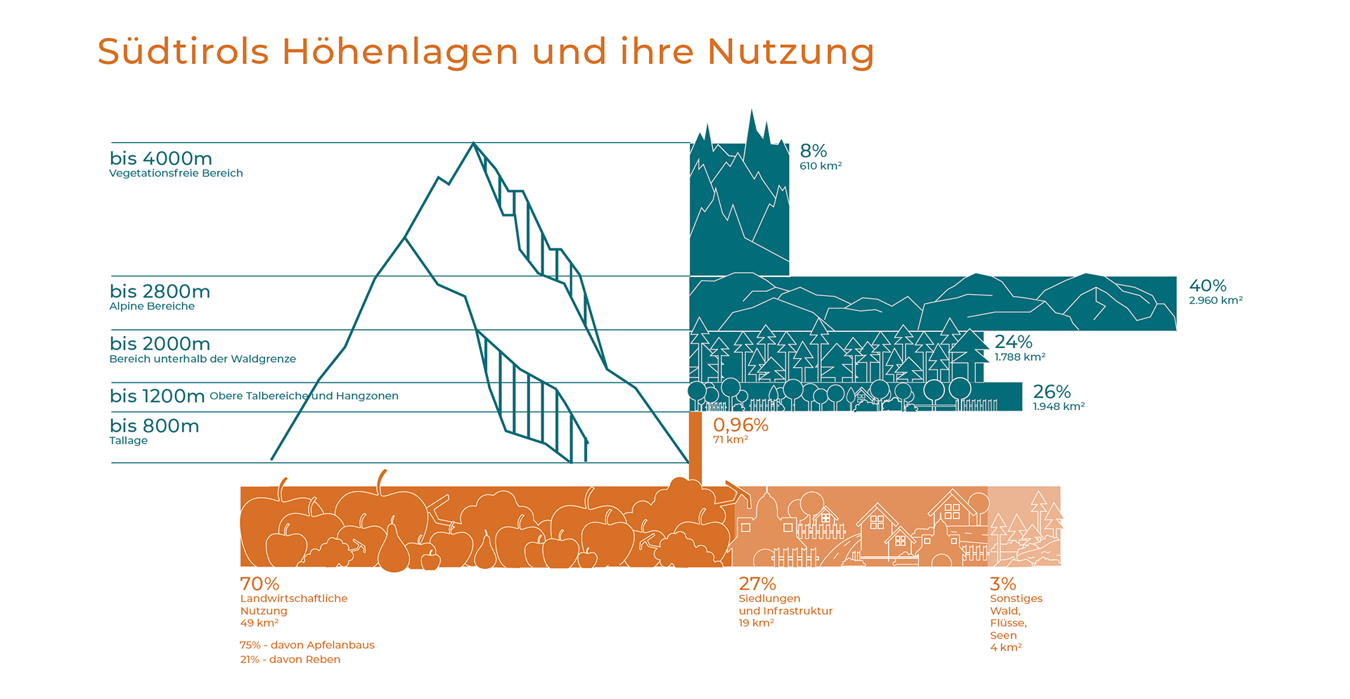
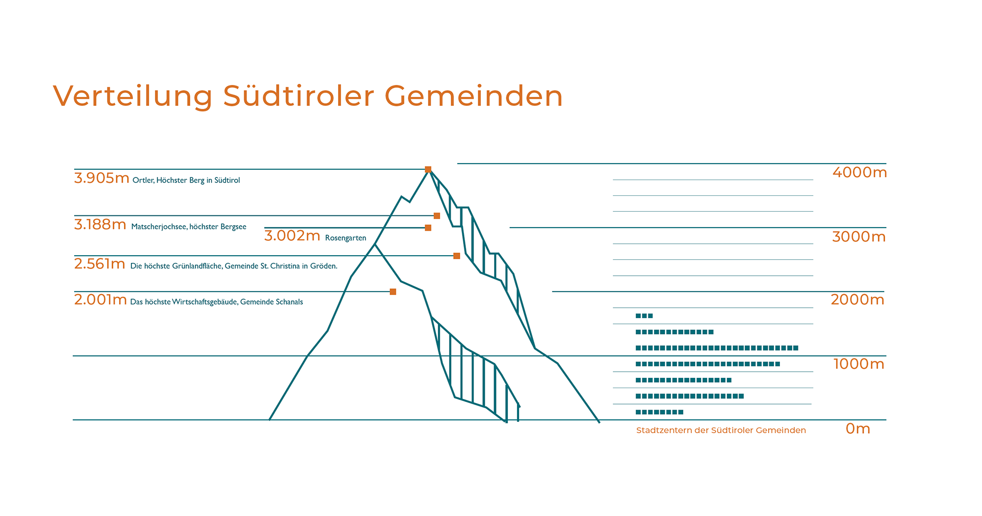
Since one of the main activities the S.T.A.R.S. is the research and presentation of data, I developed examples for the display of data in the same visual language.